From downtown placemaking to broadband planning and economic research, data-driven analysis has remained at the heart of CORI’s work this past year. To highlight the hard work that goes into analyzing and visualizing rural data, we’ve compiled our favorite charts, graphics, and interactive visualizations from 2024 below.
Mapping Affordable Connectivity Program enrollment
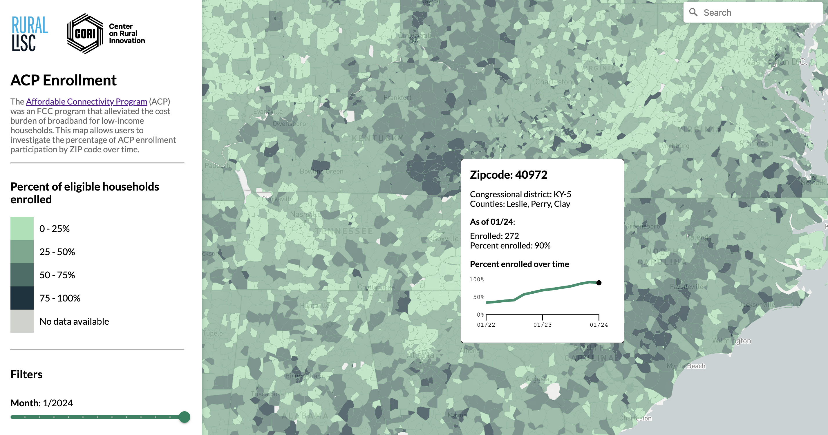
The Affordable Connectivity Program ended in June 2024, impacting 23 million households—many in rural areas—that relied on the program for reduced-cost or fully subsidized internet access. To illustrate the program’s reach and assess the effects of its discontinuation, we created, in collaboration with Rural LISC, an interactive map showing ACP utilization over time for U.S. zip codes. The map visualizes the steady rise in enrollment rates, demonstrating how, for most participants, the ACP was the difference between having access to the opportunities that connectivity offers and being left behind.
Visualizing the role of broadband in rural economic growth
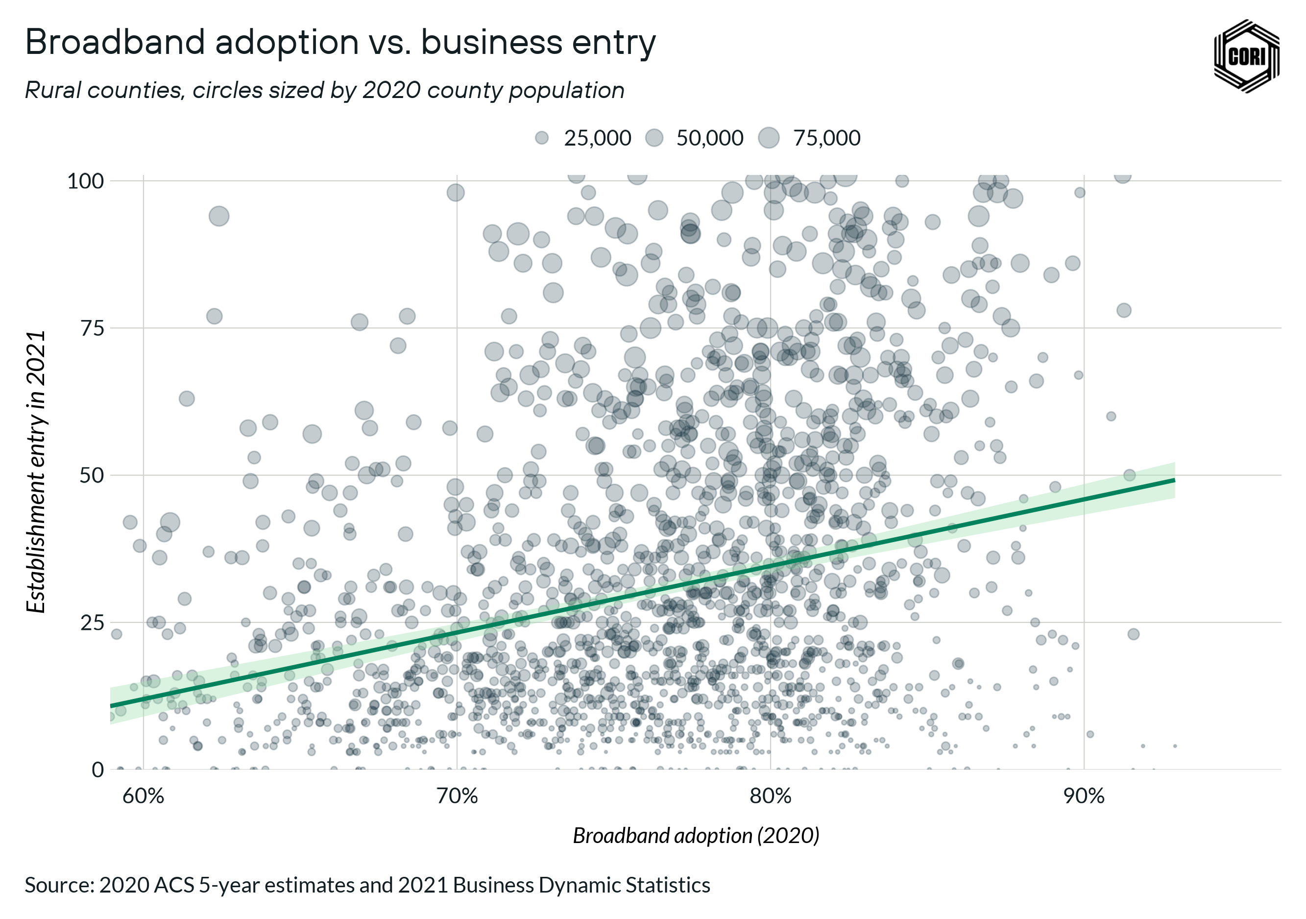
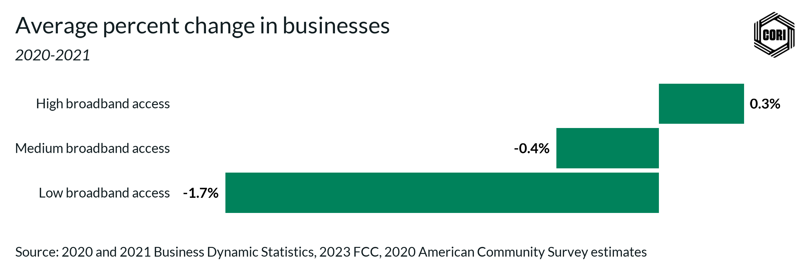
For our recent report on the impacts of broadband on rural economic growth, we visualized how higher broadband utilization (higher broadband adoption rates and a higher prevalence of small broadband service providers) improves the economic dynamism of rural areas. One key takeaway: rural counties with high broadband utilization see increases in the number of businesses, while similar counties without high broadband utilization see businesses decline.
Open data for rural placemaking
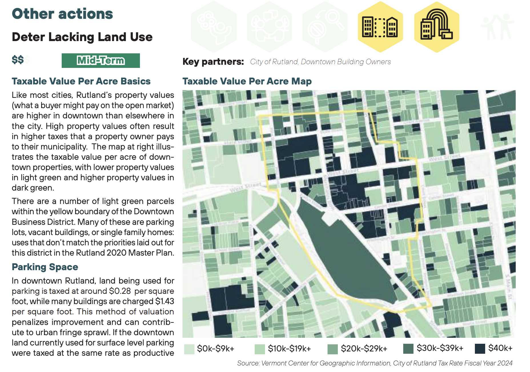
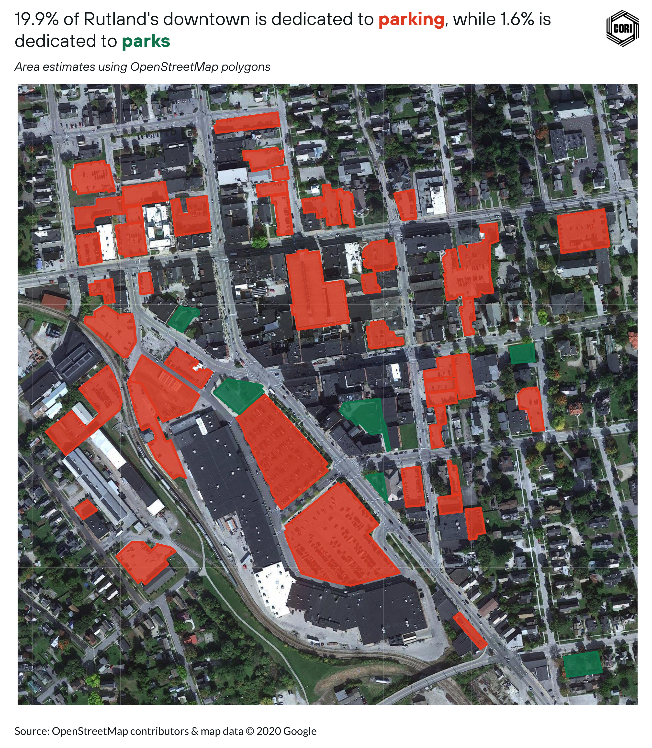
To better understand land use when developing innovation districts, we visualized OpenStreetMap and parcel tax data for the communities of Pine Bluff, AR, Selma, AL, and Rutland VT, helping residents easily compare community priorities with their current downtown structure.
Mapping broadband access and funding
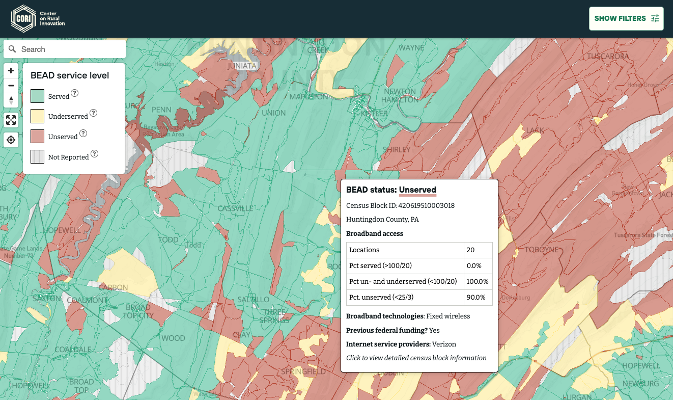
In February 2024, we released the Rural Broadband Service Map—the most detailed map of broadband service and funding available. With data displayed at the Census block level, users can readily identify areas lacking broadband access and assess grant eligibility and strategy.
Charting changes in rural voting patterns
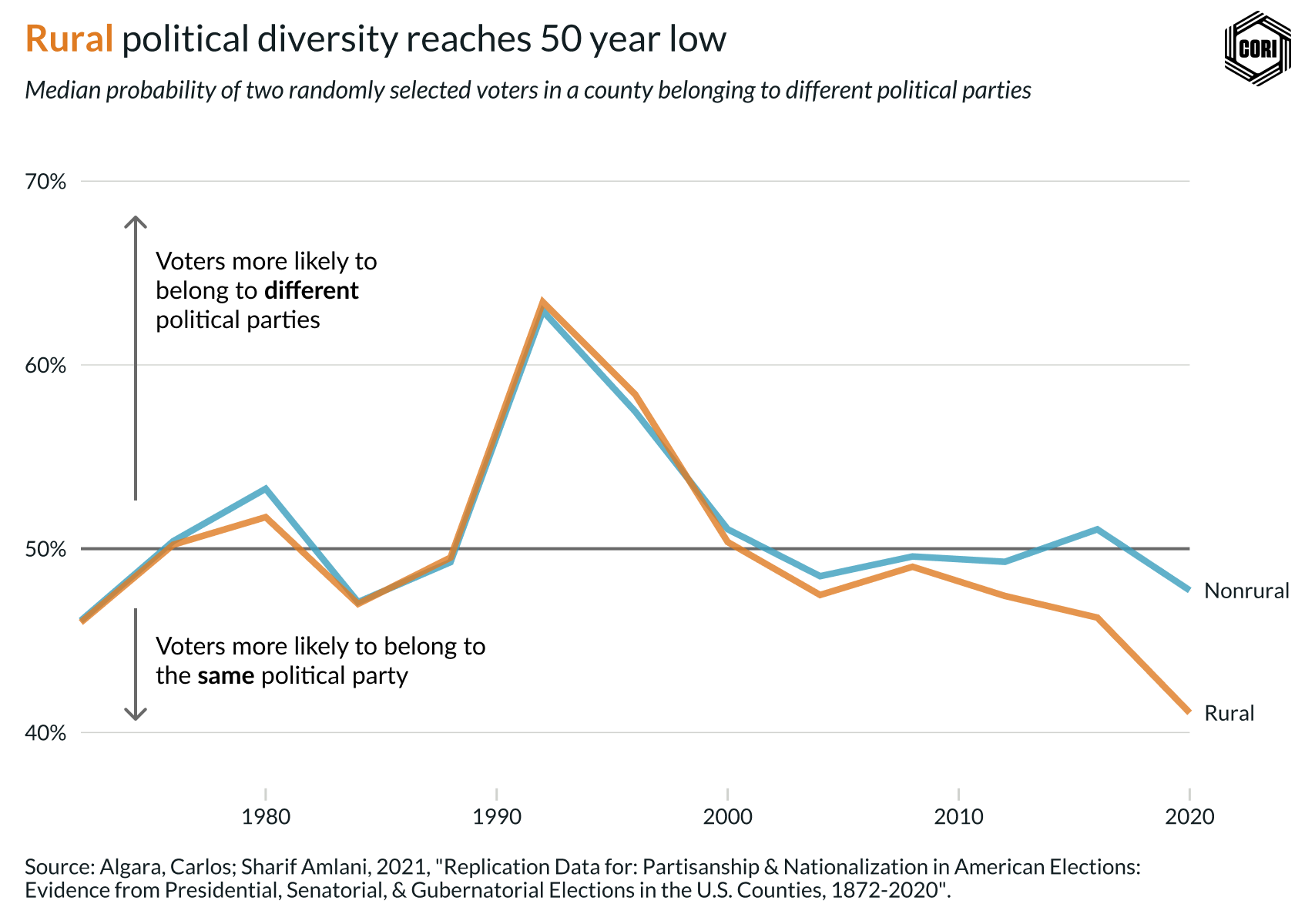
Following the 2024 election, we analyzed the recent divergence in rural and nonrural voting trends, visualizing how increasing polarization has manifested across the country - and in rural areas.
Spatial trends in rural innovation funding
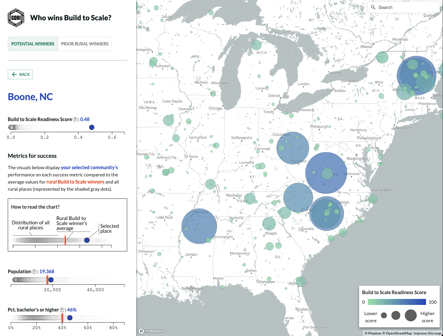
Build to Scale, the Economic Development Administration’s flagship grant program for technology-driven businesses, recently celebrated its 10th anniversary. To analyze spatial trends among grantees and identify rural communities with strong potential for successful applications, we developed a statistical model (and associated mapping tool) that leverages attributes of past winners to estimate the likelihood of a rural area receiving this prestigious grant.
Disadvantaged rural communities charting a path to economic success
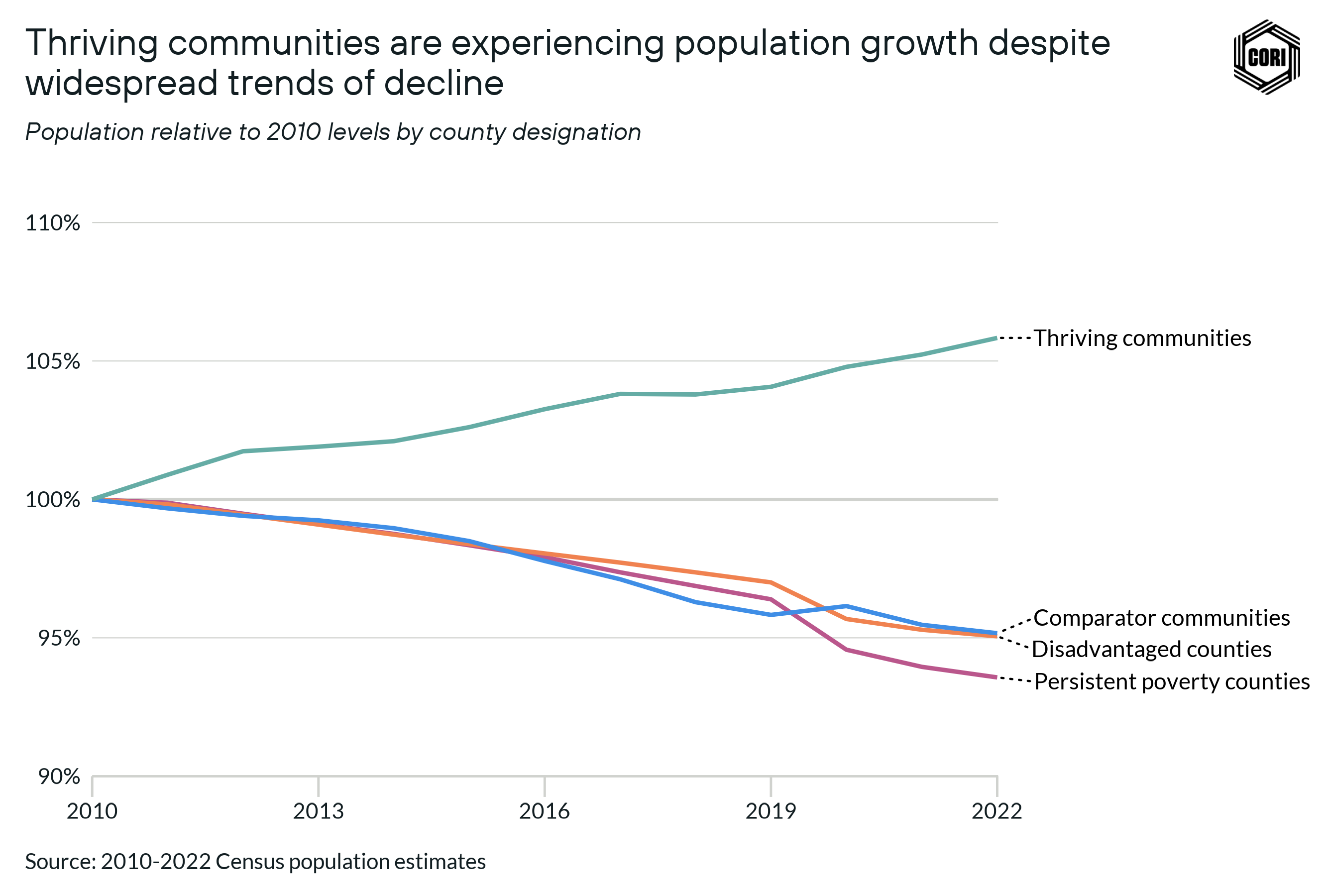
In our final installment of the Rural Aperture Project, we explored how rural communities that are most affected by systemic inequities can nonetheless chart a path towards economic success and well-being. Our data-driven analysis centered around a comparative study of 20 communities classified as Disadvantaged or Most Disadvantage according to the University of Michigan’s Index of Deep Disadvantage, visualizing the key factors that have contributed to their success despite systemic challenges.